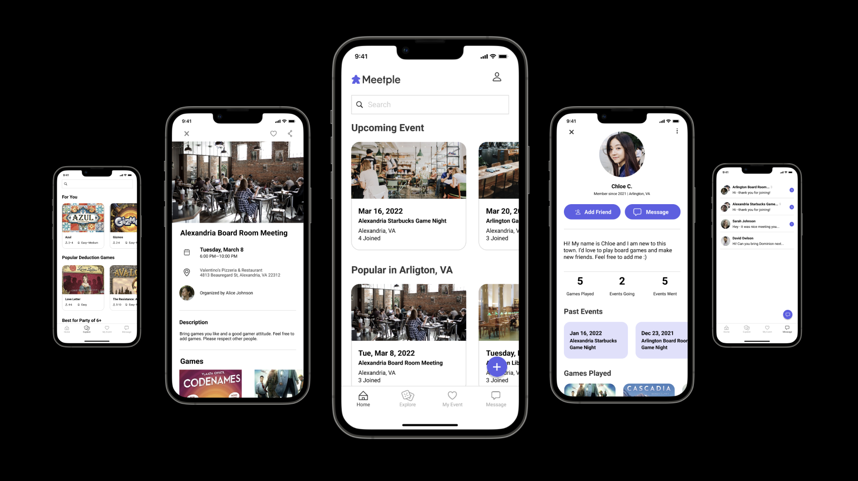
Meetple: Boardgames Meeting Application Case
Meetple is a social network application for millennials interested in playing board games and meeting new people. Whether you want to make friends, explore new board games or join local board game events, Meetple will provide all of those within one application.

Problem Statement
Casual board game players, who use board games as a social gathering, need a platform to find events, especially within a local distance. Since the pandemic, people have sought safe social gathering groups and places.
For casual players, finding the right platform to find like-minded people with the same experience and expectations is challenging.
Role
This project was a team project, and my role for this project was UX Design, Visual Design, and UX Researcher, which included User Research.
Duration: The team met once a week for three months (The new project ended in December 2021.)
Competitive Analysis
Cardboard Companion
Strength:
Intuitive fit specific user goals (niche market)
Simple UI - this helps the users to navigate
Board-game aids, such as timer, coin toss, etc.
Weakness:
Basic/common UI design
Confused UX flows (ex, menus on the board game information page could be clickable, too much scrolling down, stat score seems extra steps, etc.)
BoardGameGeek
Strength:
In-depth database of board games
The latest news and trends
Broad category filters
Weakness:
Hard to navigate (interface is old and too busy, too many pages, too many steps
Geared towards, specially to hard-core gamers, casual gamers might get overwhelmed
Meetup
Strength:
Easy to join many different interest groups
Low barrier when joining a new group
Providing various social gathering means (online, in-person, virtual tour, etc.)
Weakness:
Group creation is not free
Interests are very broad, and not too specific to our user’s interest
It can be overwhelming for users to meet strangers without much information about them
Affinity Diagram
Step 1: Import the data from the user interview/survey
Gathered data throughout the user interview and survey and made the individual data into the stickies
Step 2: Look for patterns and sort by theme
The team found the patterns and organized the stickies into groups.
Step 3: Name the groups
When every sticky has a spot, the team named each group as below:
Requirement
Refer to the Affinity Diagram above; here are the requirements for this project:
The user can't find someone to play with
Find local board game meetup places
Get game recommendations
Experience and find various board games
Users can't learn a new game efficiently
The rule book is not very informative—too many words. It's hard to visualize the instruction in a real setting.
Personas
The Meetple has targeted three different users, which are game-based, social-based, and hybrid (game- and social-based) users. Here are three personas:
Persona 1 / Jack
Basic Info
Age: 32
Occupation: Software Developer
flexible work hours, work 40+ hours per week
Marriage Status: Single
Location: Urban City
Description
avid gamer
Needs
wants to explore new games outside his clique
likes drinking environment
does not mind party games, but prefers more complex tabletop games
prefers close proximity to his location (no car)
Persona 2 / Allison
Basic Info
Age: 38
Occupation: Consultant
works 40+ hours per week, travel sometimes
Marriage Status: Divorced
Location: Suburban, homeowner
Description
busy work environment
likes drinking
has limited experience with games –only party games
Needs
want to network and make friends outside her work
Wants to spend her free time going out and meeting people
prefers less complex games, preferably party games
Persona 3 / Chloe
Basic Info
age: 28
Occupation: Graphic Designer
Work 40 hours per week
Marriage Status: Single
Location: Urban city
Description
newly moved to the town
has basic experience with BG
Needs
seeking network opportunities and making friends
eager to explore other BGs
willing to learn, but wants guidance from someone else
prefers safety over social events, prefers comfortable environment
Journey Map
Meetple is a social network application for people interested in playing board games and meeting new people. In this journey map, the users set up the profile when they want to play or are interested in board game social-gathering.
In Meetple, the users will be aware of the features of the app while exploring the app and consider attending a board game event nearby. After they join and meet people from the event, the user will have a positive experience playing and learning board games. Since the experience is positive and easy to join the event, the user will try another meet-up with different events in the app.
Storyboard
Storyboard 1: Allison and Chloe
Storyboard 2: Jack, Allison, and Chloe
Site Map
User Flow with 3 Personas
User wants to explore new mystery games
2. User wants to network and make friends
3. User wants to create a board game event
Wire Frames
Clickable Prototype Phase #1
High-Fidelity Prototype
Usability Testing Report #2 (3 people)
User #1 tested on 2/11/2022
First Impression
I got a question about the Event page: Can I click “all / going / saved / past.”
Comments
Under the sign-up menu, the pagination should be clickable.
The filters are confusing - I prefer like Zara app sort since it has a side scroll under the search box.
The main page: The New Event Only should be deleted and keep the Today’s Event Only.
The “Back” button is needed in the Join Event & Explore.
The message, Your profile is incomplete and needs more specific information (bio or game owned) on the profile edit page.
How does the user get the Game Played and Game Owned list on the profile page - Is this automatically updated through participating in the event? Or does the user updates?
What happens when you click “favorite”? It moves to the top of the list.
What happens when the user clicks the heart button on the event info page?
User #2 tested on 1/21/22
First Impression
It is very simple.
Comments
Event Join: The feedback would be nice when I click the Join button. I was confused because it went to the event page immediately. The feedback confirmation will be needed.
Create Event: How detail can I select for the location?
Event Filter: Does the map work? How are the Games displayed?
Event Result: The resulting hierarchy is unclear. | The sorting function is needed for the top search bar. (relevancy, date, location, etc.) | There is a heart and share button next to the result data. That would be good to know how far the location is from me. (ex. 3 miles from you)
Explore filter: I would only use one Min or Max player. | The complexity should be easy, medium, and hard to align with the game info page.
Explore game search result: The back button would be nice.
User #3 tested on 2/18/2022
First Impression
The sign-up is in a standard format. It looks like a Meet-up app.
The profile page looks like a Facebook app, mainly the going/have/played feature.
Where do you get the game data?
Can I go back to the page
Comments
Explore page: Is there a sort feature?
Create Event page: The Leave Event button is confusing (Closing the window or leaving a meeting.). Consider changing it to “unregister” or “cancel an event.”
The beginner-friendly option is good.
Profile edit page: Recommend adding hyperlink for bio.
Profile for others: Add a friend - can anyone add one? | It would be nice to have the block user function
Event page: What is the condition for the new event?
Observation: The filter was a little hard to find.
Solution: The filter should be on the search result box.
Game info page: The game description is too long. Suggest to have “read me” to reduce it.
Findings after High-Fidelity Prototype
After the High-Fidelity Prototype testing, here are some findings to consider to update for the final product:
My profile page will have the Game Played / Event Going / event Joined.
Add the Back button.
Change the menu to the frame tab so that the user can click the block.
Reorganize the sort and filter.
Make the Leave Event button less noticeable by using a lighter color. And provide the feedback message when the user clicks the button, such as “are you sure?”
Also, when the user clicks the Join event button, provide the feedback or confirmation window.
Remove the New Event button in the Event Search filter.
Final Product
Updated:
Deleted the “New Event Only” in the Event filter
Confirmation feedback added when the user joined the event
Added the sorting (filter) - relevancy, date, location, etc.
Updated My profile - favorites added
My event - Changed from Saved to Liked
Design
Conclusion
Lesson-Learn
What if this project was processed in the sprint?
The problem could be narrower. The objective was too broad.
The design process was too long; it must have been done in a short amount of time.
Using too many tools (applications) for this project
problem could be narrower. The objective was too broad.
Deciding on the scope was the hardest.
The map feature was debatable. Did we need it? How will we filter out user feedback?
Next Step
How might the search feature be improved?
What can other interactive features be added?
How can this app promise safety? Explore some ways to validate user credentials (ex. criminal history)
Where will we retrieve the game database
How might we attract beginner gamers?
How will the recurring event be delivered/registered? (for our project, we only have a one-time event)


