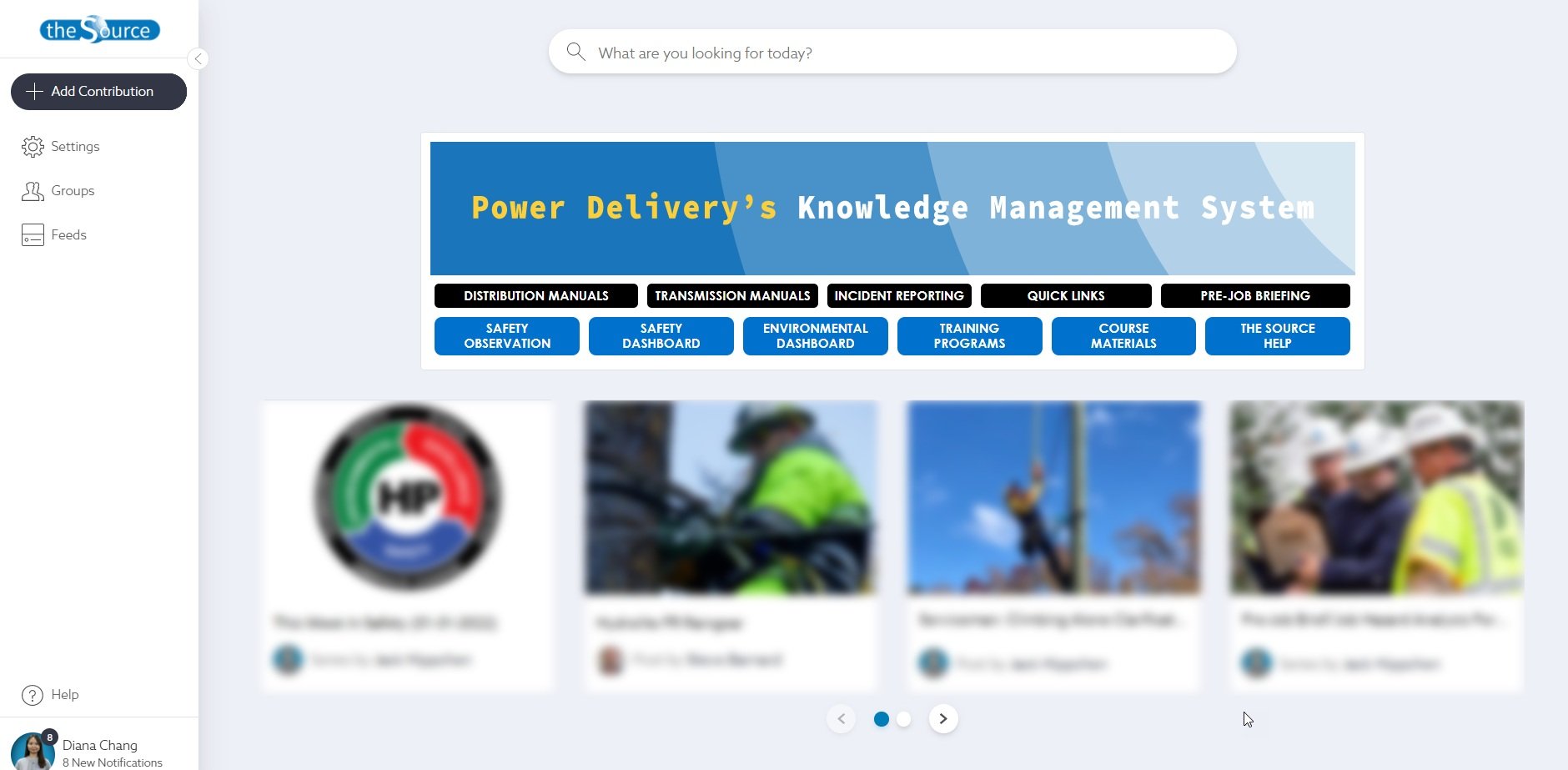
the Source: Knowledge Management System
The Source works as a one-stop site where you can find all the PowerDelivery-related materials, such as policy, manuals, bulletins, job aids, training materials, and more.
The Source was launched in 2018, and the search functionality has been improved a lot. People can find the posts and series by simply typing in the search bar. It shows accurate results.
But, since the first launch, there have been so many posts, and series are posted in the Source. Now, there are more than 3,000 posts, and series are published. However, nobody can remember the title and contents for all 3,000+ contents, and it's not getting less.
Background
The Source contains more than 3000+ posts and series, including policy, manuals, bulletins, job aids, training materials, and more. Finding the correct reference materials is critical for the field and office employees at the company. The Source has been increased the searchability of contents. However, the employees were still having issues searching the materials since there was too much content in the Source.
The communication team and I wanted to tackle this usability issue and raise awareness of utilizing different Source features to increase searchability.
Role
Learning & User Experience Designer
User Research, Visual Design, Prototyping & Testing, and Pitching
Duration: January 07 - October 31, 2021 (The updated version launched in September 2021.)
Note: This is a collaboration project with a communication group to update the current knowledge management system user-friendly.
Understanding the Problem
I conducted surveys with the communication team to understand users’ pains. It was revealed that:
Users take time to find the materials in the Source
Users wanted to see all their work-related materials at once
Users didn’t understand the filter functionality in the Source
Business Goals
From these findings, the communication team and I decided to identify key business goals:
We want users to find the most relevant and recent materials faster
We want users to find their group or department-related materials using filters
We want users to promote and educate the other functionalities (e.g., filter, bookmark, banner, etc.) in the Source
Executive Summary (Initial Survey)
The majority of users surveyed were familiar with the Source and had a general positive view of it. However, more than 70% of users answered they still have issues finding the content quickly.
Over half (53%) of users stated they had not used the filter functionality before today. Of those that do filter, 53% only filter by categories.

88% of users surveyed stated that a training video would be helpful to them.

There are multiple options that users want to see all the work-related materials at once.
When filtering, users surveyed individually had to be continuously reminded of the "show more" button, clicking off the filters to see content already filtered, and not to search the category search bar for content.
Prototyping
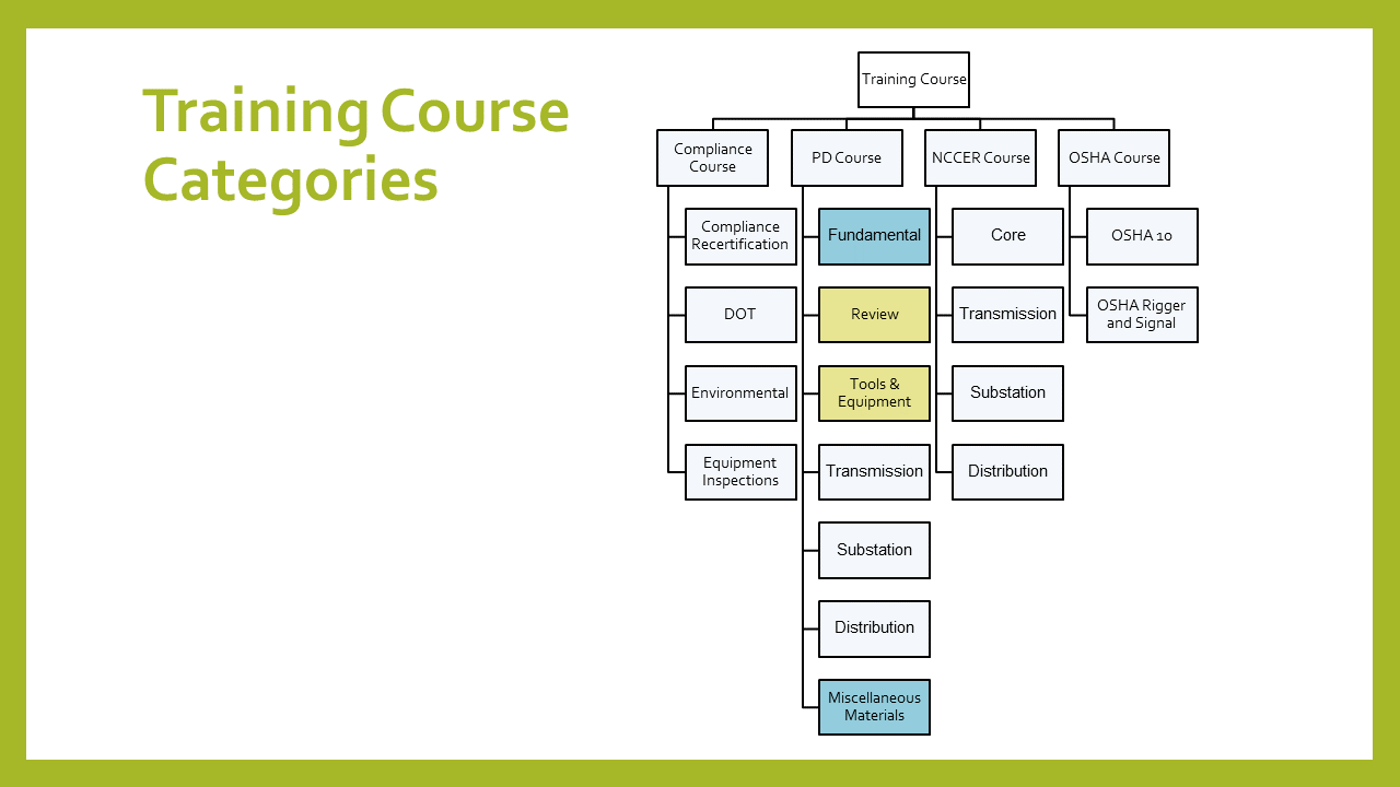
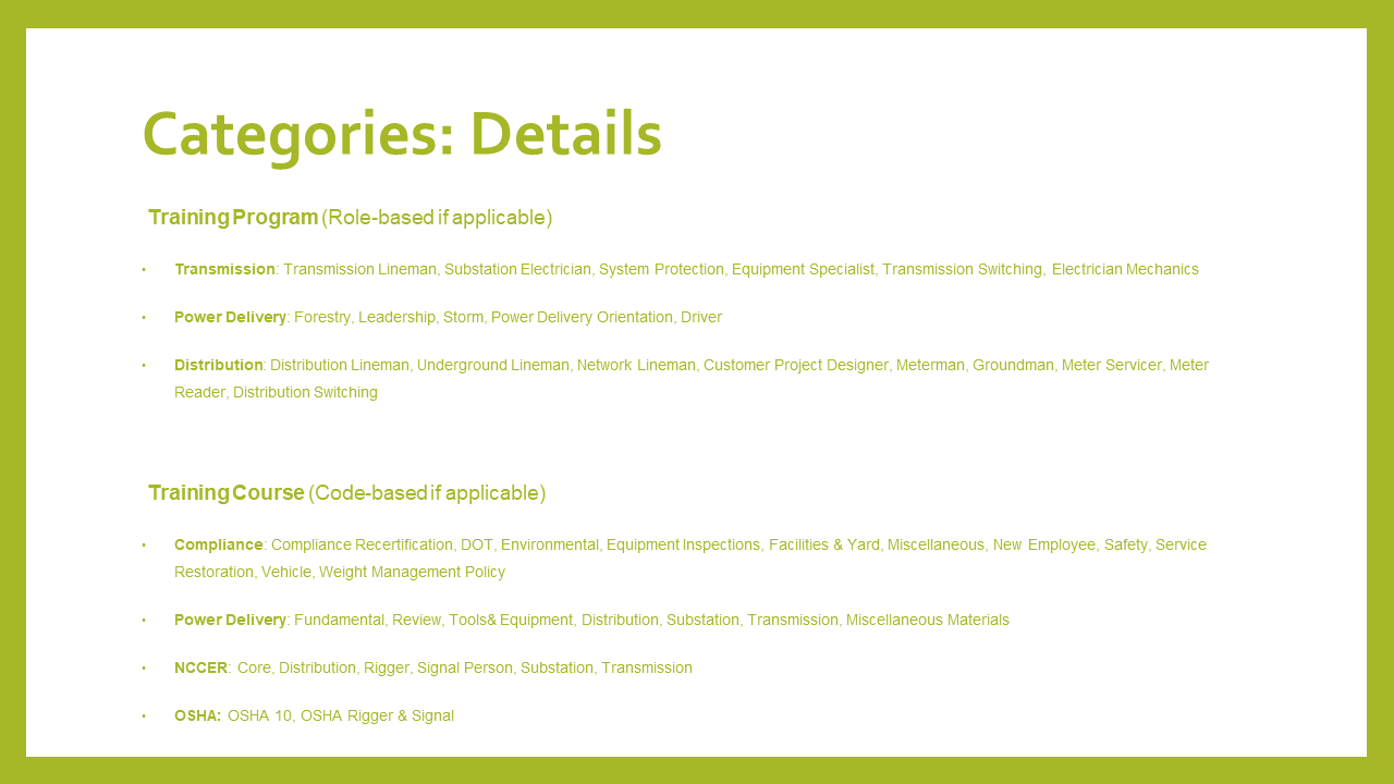
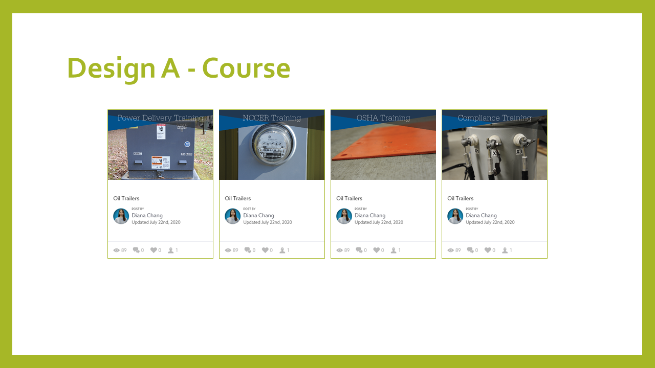
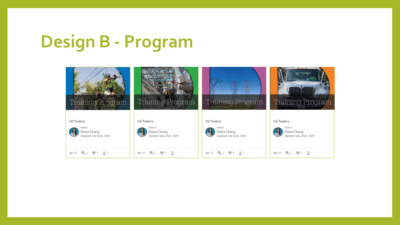
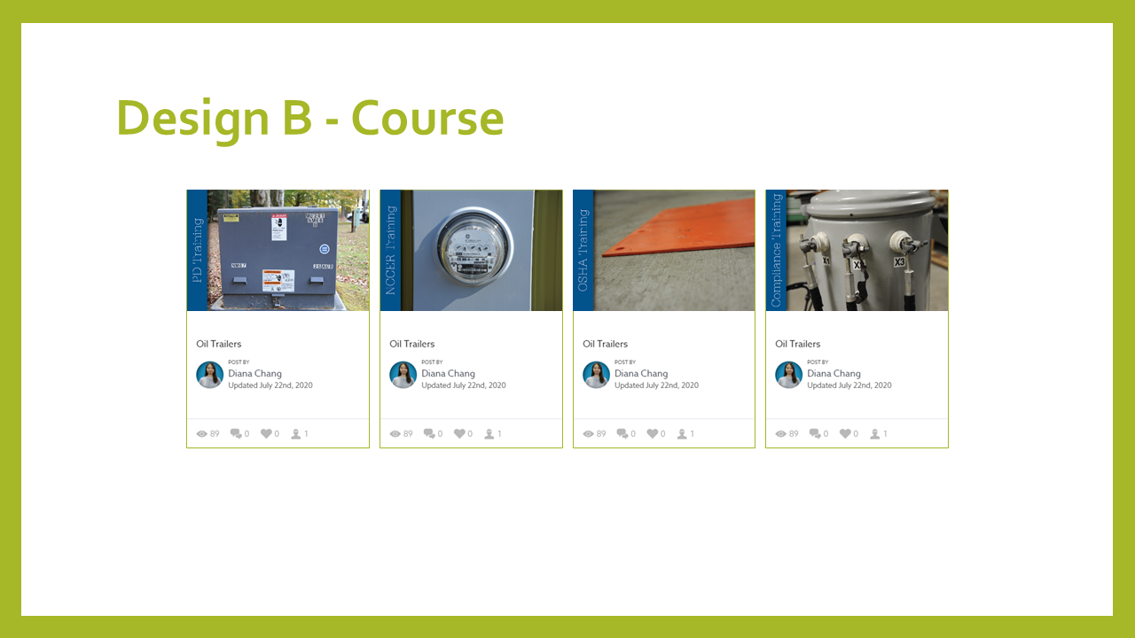
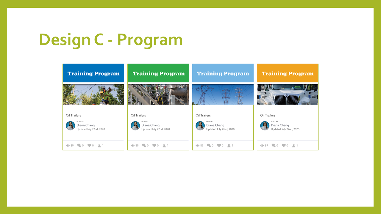
Categories
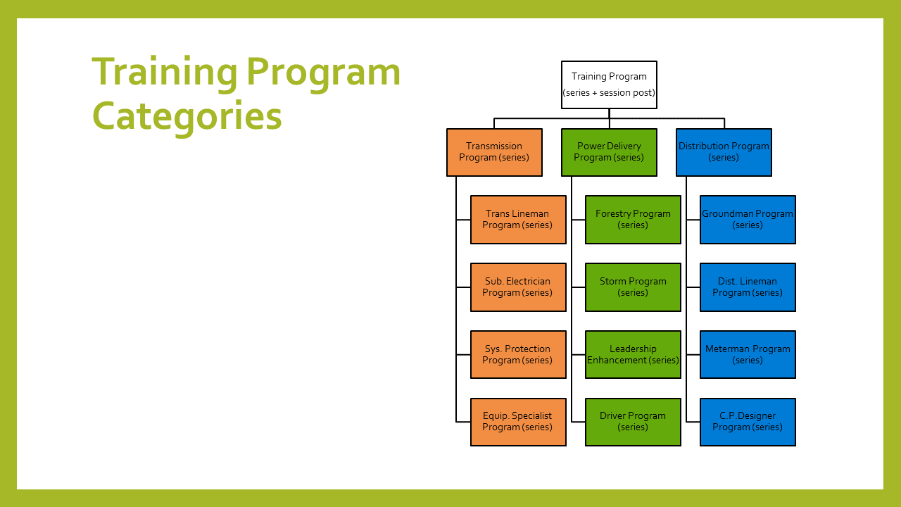
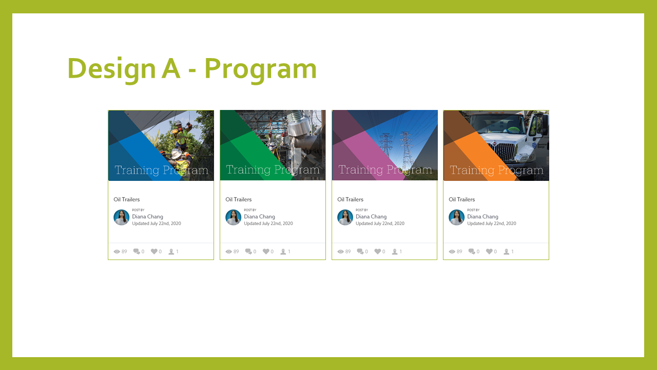
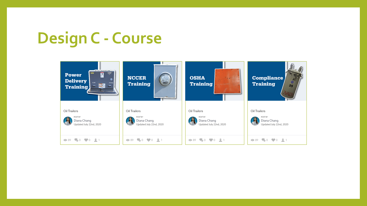
The communication team requested the Bloomfire personnel to create a duplicated version of the Source. And the communication team updated general categories, and I updated the training program and course categories using the duplicated version. This includes updating a new thumbnail design for the training program and course posts.
Here is a PowerPoint for details:

Objectives
For user acceptance testing,
Determine employee sentiment toward the PDST’s knowledge management platform, the Source
Determine how employees use the filtering functionality and how employees find information in general
Gather feedback on how the Source is organized
User Testing
The communication team and I conducted a total of 37 user testing among 5 different groups to test the functionality of the Source.
During the user testing, we were able to include various employees who have Supervisor, office, and field roles.

Valuable Insight and Feedback
After gaining valuable insight and feedback on the prototype, the communication team and I organize the insight and input by the topics. And, here are some feedbacks:
A short video on where the filter is located and show how to click it to pull up the menu on the left. Most trainees do not know it is there and just type in the search bar to find what they are looking for.
Searching for direct information can be a problem. Updated and outdated information cannot exist on the same platform. This will require some form of document control to be successful.
Voltage tester in the search field and then narrowed by manual. The directions are too vague to know exactly what to look for—too many manuals.
There was confusion between [General Safety] and [Safety Topics].
Too busy on the screen, but it seems like the right amount of filter for the contents.

Issues Identified with the Source
During the survey, common trends were identified:
Employees do not know how to use the filtering feature.
Some categories are not logical and are often too broad.
Two types of categories (e.g., Work Methods, Driving & Vehicles)
Employees suffer from an information glut – too many posts to sort through.
Employees are often unable to load/access the Source due to problems with the internet.
Bloomfire's filtering UI and other features are not user-friendly to employees.
Some posts are out of date or not being used anymore.
Solution
The communication team and I recategorized those issues with possible solutions based on the feedback.

Priority Rankings & Solutions
Based on the issues, the communication team and I discussed the priority solutions based on the user needs and business goals. We also highlighted some of the IT and Bloomfire issues as 3 to improve the user experience.

Prototype Changes
Featuring the Source tutorials in This Week In Safety email
The communication team will include the Source tutorial videos in the weekly communication email to promote the functionality of the Source.
Adding Help button to Promo Bar
I redesigned the promo bar in the Home banner and included the Help button to keep all the Source-related job aids or tutorial videos.

Using the facets feature in Bloomfire to silo Content category & Descriptor category

Auditing Categories
Review the category names to reduce the user’s confusion—for example, Equipment, Materials & Tools vs. Driving & Vehicles.
Adding customized personal feeds, prefiltered content based on employee title

Benefits
The updated Source has been in use for 5 - 6 months now and has received a User Satisfaction score 95%. The current user group is over 5000. And, the communication group gets 50% fewer complaint emails.
Next Steps & Items to Consider
Make those changes in the Source Archive communicate to present to the Leadership.
Conduct an exit survey to determine how these changes affect employees.
Use the same focus group
Use students at the training center
In-person focus groups when possible
Include training videos on the Source or in classes at the training center